The Setup:
The following company is a high end rehabilitation facility which focuses on behavioral issues and substance abuse.
Treatment here costs roughly $30k per month.
They needed help with their paid search landing page. The purpose of the page is to get prospects to either call in or fill out a form for more information about the facility. At that point a sales person reaches out to them and gets them into treatment.
At $30k per month, leads are VERY important for this business and they needed more of them.
About 50% of visitors were potential patients with the other 50% being those that are looking for help for a family member or friend.
The Original Page:
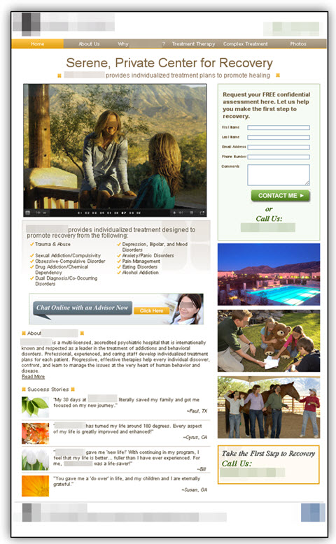
They came with the page to the right which was had a pretty low conversion rate – less than 1% of visitors actually reached out to the facility for more information.
What happened was an analysis of the page’s weaknesses, and a treatment page was developed. The treatment page was then split test against this control page.
Page Weaknesses:
The following issues were pointed out as areas of improvement for the page.
Unnecessary Navigation – After going through the mini site, the navigation didn’t really do a good job of telling someone a “story”. It was more like quick tips, and really didn’t paint a picture very well for someone that needs rehabilitation services.
Copy Length – Given that the product is high end and takes a lot of commitment, there needs to be enough information about the facility on the page to make someone want to seek more information. The original page doesn’t really do a good job of telling people how the facility will help them, what it’s like to go there, etc. It just lacked some crucial information that should be present during this part of the sales process.
Images – The images that are being used here don’t really do a great job of giving additional value. For example, they have a picture of people with a horse. What this is, is a specialized treatment called Equine Therapy. However, a lot of potential patients might not know what that even is, and worse yet the page doesn’t even mention it. So people with a horse just looks out of place and confusing.
Form Placement – The form is out of the eyepath. Given that we are so used to the right hand side having things like ads and supporting copy, emphasis isn’t placed on the main call to action.
Credibility Issues – Given the sensitive nature of the service they are offering, they need to have some accreditations on the page. Some certifications would establish more credibility and look more professional in general.
Call to Action – They are really focusing on the incorrect “Ask” here for potential patients. Given that they are a high end facility, their form emphasizing a “FREE Assessment” isn’t really the correct play here. Selling on price isn’t generally a good idea if the product/service is high end. Also, they say “assessment” which can sound like a lot of work. What people are really here to do is inquire about more information. That should be what we ask them to do.
The Test Page:
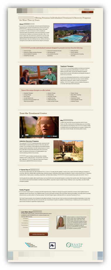
The solution to the original page is displayed below. The following changes were made:
Unnecessary Navigation – Since splitting up the pages via navigation didn’t really provide any additional value, the navigation was completely eliminated
Copy Length – The copy was completely re-written in long form. It addresses the customer thought sequence much better by identifying the following and answering potential questions from prospects.
- What the facility treats – Can they cure my problem?
- How they treat problems – What treatments do they offer patients?
- A tour of the facility which includes a video of past patients and a rotating image that shows the facility – What is it like to go here?
- A typical day – What can I expect every day here?
- Family Program – Can I see my family?
Images – The images that are used here support the copy much better than the previous images. No random images without explanation.
Form Placement – The form is placed directly in the eyepath. While it is at the bottom of the screen, that is done so that value can be given before we ask the prospects to do anything.
Credibility Issues – Facility accreditations and awards are displayed near the call to action. This adds a level of professionalism and credibility.
Call to Action – This was changed to “Learn More About” instead of the “Get a Free Assessment” angle. This is a more appropriate ask from prospects – especially to the target market which have large bank accounts that don’t care too much about cost.
Original Page (Control)

Test Page (Treatment)


Summary:
The treatment page was put up against the control with a A/B Split Test. So when comparing results, we will see that the number of leads were increased by 220% with a 98% Level of Confidence!
The biggest issue with the control page was it wasn’t correctly following prospects’ thought sequences. They wanted to know enough about the facility before they chose to reach out for additional information. So by removing distractions, enhancing credibility and giving them additional relevant information, we were able to increase the performance of the landing page.
The above test was run by Kyle Chapman who is the CEO of Conversion Marketing Services.
Let’s see if we can’t help your website out the same way Kyle helped out the rehabilitation facility used in the case study above. Simply fill out the short form below, and we’ll start improving your website today!
Want more sales or leads?
We’re excited to help!

